Hello Tony,
following is the short solution for the problem based on your actual implementation:
Step 1: Navigate to the class Application::PushButton and change their the property Visible of the Border view to the value true as shown in the screenshot below:
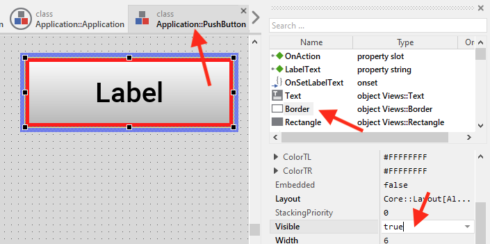
Step 2: While the Border view is still selected, change its property Color to the value #000000FF.
Step 3: Navigate to the class Application::Application and open its method UpdateViewState. Replace the implementation of the method by following code:
// First give the ancestor class a chance to process this event.
super( aState );
Step 4: Still in the class Application::Application open its method onTabKey and replace the implementation of the method by following code:
if ( PushButton1.Border.Color == #FF1700FF )
{
  PushButton1.Border.Color = #000000FF;
  PushButton2.Border.Color = #FF1700FF;
}

else if ( PushButton2.Border.Color == #FF1700FF )
{
  PushButton2.Border.Color = #000000FF;
  PushButton3.Border.Color = #FF1700FF;
}

else
{
  PushButton3.Border.Color = #000000FF;
  PushButton1.Border.Color = #FF1700FF;
}
Your approach to modify the border color directly is not ideal. I would rethink the application case.
Analyze: You want a button that should appear with red or black border, right? The red border appears only when the button is selected. The user should be able to toggle through the buttons by pressing the TAB key. I suppose, the user will also be able to activate the just selected button by pressing e.g. OK key, etc.
If the above analyze is correct, following could be a better solution to implement such buttons:
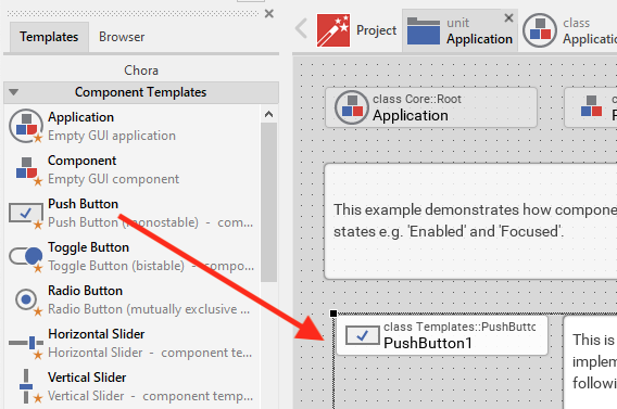
Step 1: Add a new button component to your unit Application. Use the provided templates for this purpose. More details can be found in Creating components from templates). Following screenshot demonstrates the step:
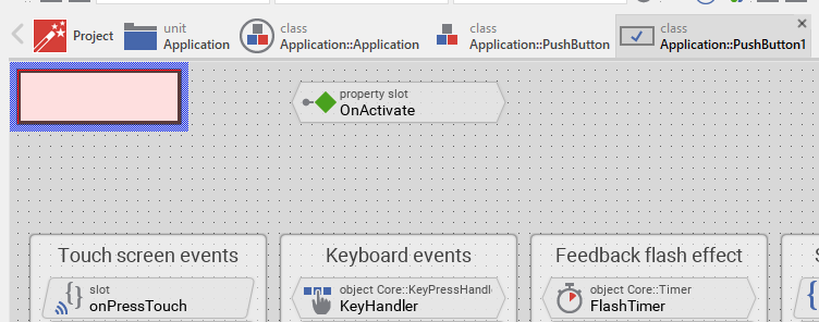
Step 2: Double-Click on the just added PushButton component to open it. You see the implementation of this component now. For example:
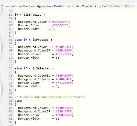
Step 3: Open the UpdateViewState method of the just added PushButton component. There you see code to colorize the background and border depending on the status of the button. Modify this code as shown in the screenshot below. Here you can also adapt the behavior of the button more flexibly. You can e.g. determine which colors should be used when the button is activated (pressed), etc.:
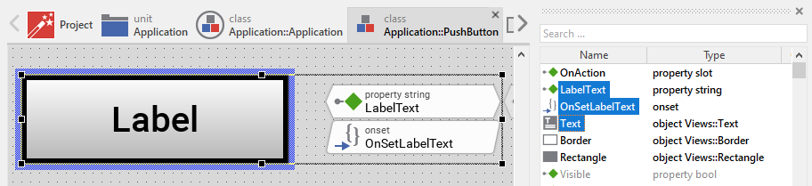
Step 4: In your old button component (Application::PushButton) select the members Text, LabelText and OnSetLabelText. Copy the selected members by pressing the keys CTRL+C:
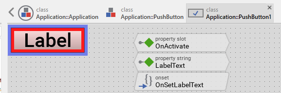
Step 5: Navigate to the new Push Button and paste there the just copied members by pressing the key CTRL+V. Thereupon the previously copied Text view and the LabelText property is added to the new Push Button. Adjust the size of the Text view to fill the complete Canvas area. Move the property to not overlap the existing OnActivate property. The following screenshot demonstrates the result:
The Push Button is ready now.
Step 6: Navigate to the Application::Application class where you want the Push Buttons to appear. Being there open the UpdateViewState method and replace its implementation by code as shown below:
// First give the ancestor class a chance to process this event.
super( aState );
Step 7: Being still in the Application::Application class select the old buttons and delete them. The application should be empty with the gray background only.
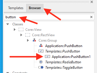
Step 8: Search in the Browser window for the new created Push Button component. You can enter button in the Search field for this purpose:
Step 9: Drag&Drop the found PushButton to the Application component while holding down the CTRL+ALT keys. The following screenshot demonstrates it. More details are found in Create new embedded object:
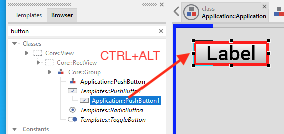
The above operation adds a new instance of the Push Button class. Resize and arrange the button as desired.
Step 10: Repeat Step 9 if you need more buttons.
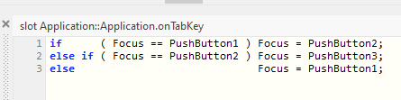
Step 11: In the Application::Application class open the slot method onTabKey and implement following code to toggle the selection over the buttons. The implementation assumes you have three buttons:
That is all. The application contains several buttons and each time you press the Tab key, the application selects the next button. The buttons are also able to react to user inputs (on the keyboard the key Enter). When you connect slot methods to the buttons, the methods are executed when after selecting the button (with the key Tab) you activate it with the key Enter.
I hope the explication helps you further.
Best regards
Paul Banach