Hi,
regarding your first question I would refer to the article Height attribute. It describes the relation between the specified font height and the size of the displayed glyphs. In particular, the specified font height includes the ascent and descent area lying at top and bottom of the row. The values for ascent and descent are derived from the information the font dsigner has specified. The values ascent and descent are essential for multiline text to determine the distance between text rows. In other words, when you specify font height = 14, you get a font ideal to displays text with 14 pixel distance between the text rows.
If you want the glyph to have 14 pixel, you have to increase the value of the Height attribute. Since the additional ascent and descent are design details of the individual font, you will need to try out various values until you get the desired glyph height.
Regarding your second question. This problem has two reasons. The first one is the 'kerning'. With kerning the distance between the glyphs is changed dynamically depending on the combination of glyphs. Unfortunatly, Embedded Wizard doesn't support kerning. We plan to add this feature in next versions. The second reason is more font specific. The font SEGOE, for example, is optimized for the Windows font engine. This technique depends on the information how the pixel of the LCD display are composed from the red, green and blue components. Knowing this, the Windows font engine modulates the intensity of the red, green and blue pixel components individually as if these were sub-pixel. This results in a 3-times heigher resolution seen in the horizontal direction. The glyphs appear more smooth.
Since Embedded Wizard doesn't contain an integrated font engine, the above described tricks are not possible. To display text Embedded Wizard uses pre-rasterized font glyphs. This means, the glyphs are drawn at the design time and stored as small bitmaps. At the runtime, in the target, the bitmaps are simply composed together. This is essential especially for target systems with low CPU performance and less memory. A font engine expects a lot of power.
The unique workarounf is to use other font, which looks better when it is very small. The fonts from the Roboto family are not so bad.
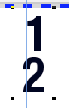
Regarding your third question, the glyphs appear correctly. They are centered. The problem is, the glyph '1' is not symmeric. This is a detail of the glyph itself. The text rasterization has no knowladge about this. Please see the screenshot below.´:
Regarding your fourth question, the distance between two text rows in multi-line text is determined primarily by the used font. Above in the first answer I mentioned the font ascent and descent. These metrics determine the default distance between the rows. Embedded Wizard uses this value per default unless you override this distance by specifying your desired value in the property RowDistance of the Text view. Please read the manual chapter Change the distance between text rows.
I hope it helps you further
Best regards
Paul Banach